Thursday 12 December 2013

MoMA Artwork


                                                                     Black In Place

Artist's name: Susan Rothenberg 
Date: 1976 
Medium used: Synthetic polymer paint and tempera on canvas.
Dimensions: 68 1/4" x 7' 1 1/2" (174 x 217.2 cm) 
I like her style of artwork because I find this artwork very comforting to look at. The colours work well with each other and create the feeling of safety. I think that the horse having no expression adds to the artwork and the horse. I like the sketchy rough kind of look and how the paint looks rough to create the feeling of texture. 


Black Beast II 
Date: 1957
Medium used: Painted on sheet steel 
Dimensions: 8' 9'' x 11' x 6' 5'' (266.7 x 335.3 x 195.6 cm) 
I really like this artwork because it so interesting to look at. I like how the creature is very mysterious and looks to be unpredictable. I really like the background it looks very foggy and clouded, you don't really know what out there. I like the sharp edges on the creature it create a really interesting effect of danger. I like that you can't really tell what this shape or creature really is, it creates a lot of visual interest for the viewer. 


Study of a Baboon
Artist's name: Francis Bacon
Date: 1953
Medium used: Oil on canvas
Dimension: 6' 6 1/8'' x 54 1/8'' (198.3 x 137.3 cm) This painting is really cool to look at because of how detailed the baboon really is, it looks like the artist put a lot of effort in creating this animal. The large fence creates a feeling of industrialism, it creates the feeling of human society and how human's keep animals in captivity. I love how the artist created the tall grass it looks like its swaying in the wind. I like how the baboon stands out from everything else the colurs work really well with each other. 

Wednesday 11 December 2013

Carrot Trouble

                                         
This was a short stop-motion Anikka, Sabrina and myself created. We showed teamwork in our short flim using clay figures. The story starts off with are main charater the the red and yellow eared creature plants a carrot seed in his local garden. 2 days later he decides to go check to see how his carrots doing. He than try's to pull his giant prize out from the ground but finds that he is unable to do it alone, so he call's out for help. Four other clay characters help out their new friend by helping him pull out the giant carrot. When the five clay charters finally pull it out the carrot the each break off a yummy part of the giant carrot one for each clay figure. The munch the carrot as they walk together out of the garden and return each hand in hand and let out a big YAY for all their hard work!!

Wednesday 27 November 2013

The Principles Of Animation

Exaggeration
Exaggeration in stop motion is when you exaggerate the actions, facial expressions, and moods of a character thing. You create dramatic expressions and scenes in your animation.

Solid Drawing
Solid drawing is creating 2-D cartoon animation into 3-D animation by adding value and shading to create a 3-D elusion.


Appeal
You animation has to look appealing and unique to attract viewers and have visual personality of its own.
http://youtu.be/-a2W6JkBr2M

Timing
Timing is having a smooth nice action or effect, to create something great with patience and the right timing.

Wednesday 20 November 2013

Rymdreglage 8-bit-trip


Food About You

Check out this awesome film!

The Sandercurl Technique

This stop motion technique creates the elusion that the clay is actually moving off the ground. Although the clay actually never leaves the ground at all. I think that this stop motion tip is useful because it allows you to create the elusion of jumping. The clay never leaves the ground, the clay is moulded into a stretchy piece of clay and is brought onto the ground on the other side. This tutorial is demonstrating the squash and stretch technique.

Thursday 7 November 2013

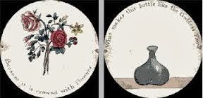
Thaumatrope


History: 
The name means ''turning marvel'' or ''wonder wheel''. Dr. John A. Paris made the toy popular and was an animated entertainment for children.

How it works: 
The Thaumatrope is made up of a small disc and is tied together by two pieces of string. You work the toy by pulling both ends of the string and that rotates the circles which creates the feeling of movement. When the Thaumatrope is spun the movement creates an illusion that flowers appear to be actually in the vase. 
Why is this toy important:
The toy was important because it was the start to the area of animation and provided children with  animated entertainment until the final development of the modern cinema. The toy later got turned into the Phenakistoscope a much more advanced version of this simply animated toy.

Bionicle Stop-Motion

I found this stop-moton very interesting because I like the technique of how the combined film and stop-motion together it makes a really cool effect.

Tuesday 5 November 2013

Dot the Worlds Smallest Stop-motion

The stop motion techniques I learned:
One of the stop motion techniques I learned from watching the making of Dot was that since Dot  is so small they needed a camera that could magnify blood samples to capture Dot. Anther technique I learned was they used a metal rood to move around dot through the scenes and then the edited it out for the final finish of Dot. One other technique I learned was they made many different versions to solve the problem that she is not posable.

Friday 18 October 2013

Chess Piece Composition

I created a sketch drawing of a chess piece but I didn't put in the middle because that would be boring. I put my chess piece off to the side to make it more interesting for the viewer and made the viewer have to look for the chess piece. I made their eyes take a path through my sketch drawing. The viewers eye starts at the bottom right corner and than fallows up the jagged shaded line to the queen chess piece.

My chess piece is realistic because its tall and skinny just like the real chess piece I was given to complete the assignment. My chess piece has the right amount of lights and darks and thats what gives the 3 dimensional effect. The chess piece has shadow which shows where the light is not shining on it, just like the real one.

I created value by shading in some of the lines and shapes darker than others. For example I shaded in my chess piece lighter and darker to create the elusion that its 3 dimensional.

 I used the three different pencil weights HB, 2B, 6B to create that feeling of 3 dimensional shapes. I created movement throughout the drawing using the jagged lines to attract your eye toward the chess piece.  Pattern in my sketch was created with the different shades of grey and white lines. Overall I think I did a good job on my chess piece and I enjoyed the assignment.

Wednesday 9 October 2013

''Sleeping Betty''

                          Check out this funny video by the National Film Board of Canada.

Monday 7 October 2013

Logo Assignment: POUNCE

Black and White Fox Logo #1
Black and White Fox Logo #2
Final Coloured Version of Fox Logo

Written Paragraph:
My logo is of a fox. It is for the my company called POUNCE. A company that manufactures a new kind of cell phone. They use any operating system, iPhones and Galaxy or Blackberry.

Artistic statement:
I created my logo with curvy lines to outline the fox because I wanted to create the feeling of texture in my logo and to create the feeling that my fox is real. I wanted to create the feeling of fur sticking up on the fox, so thats why I didn't make my fox completely with straight lines. I decided to create the feeling of movement in my logo by making the fox look like he or she is pouncing. 

The fox itself ties into the logo because the fox is actually symbolizing the name go my company really well because the fox is pouncing onto the word pounce. I liked the text I choose for my logo it really stands out well on my logo. It is easy to read and big. I also think the fact that I made the whole wordmark in capitol letters it really stands out with a strong line rather than upper and lower case letters. 

The fox in a way takes your eye toward the name of my company which I think works really well. The one colour that I decided to use for my fox was a classic orange foxy kind of colour for the eye and the name itself. I used different shapes in my fox logo because a I wanted to create the feeling of back legs and pawls. 

I learned out how to use the pen tool the best well creating my fox logo in illustrator. This assignment was really helpfully to me because I learned the basics of using illustrator and how to create an effective logo in general. 

It was also really helpful of Mrs. Silverman to show us which kind of logos used the right amount of colours and the right kind of text. She showed us some bad examples of text where you couldn't even make out what the company's name was. She also showed us logos which the colours were way too much for the logo and the text. 

I am happy with the way my logo turned out. It is a recognizable animal globally and really matches my personality. I really like how my fox is pouncing on the the POUNCE it really works. The one thing I might consider changing is making one version of the fox which is complety orange just as a test to see if it looks any better than the unfilled fox.

Overall, I enjoyed this project and I hope that we get a chance to do something similar in the future creating logos. 

Thursday 3 October 2013

Group Art #1

  ''The third class Carriage''
By Honore Daumier

We as a class did are own version of ''The third class Carriage'' by Honore Daumier. We created a series of pictures by cutting up the painting and giving each piece to a different student in the class. We used black pastels to create the lightness and darkness of the painting, creating value in the picture. Each person had a different perspective on how to draw the piece they were given so when the picture was finished some the parts didn't match.

Some parts of the painting were shaded in more or some parts got left out. We created two different versions of this painting, a stretched one and a distorted one. In the end the painting looked very interesting because of how much of the many people’s personal strokes and shades went into the picture. I liked how each person had their own way of picturing the image.

Friday 27 September 2013

Paint of Tranquility


‘Paint of Tranquility’
By Morris Louis 1912-1962
                                     
The "Paint of Tranquility" painting is not real art because you cannot clearly see any person or object in the real world. The painting just look like a lot of thick coloured lines. To make this painting better you could add lot’s of detail and make the painting look like something from everyday life. 

The painting is smudged with black paint in the middle and the makes the painting look like its been trashed or damaged. The painting does not have any meaning its hard to tell what is happening, there mixed emotions such as happiness through the colors, sadness because of the rough brush stroking. The painting looks like something that a young child would have created it in preschool.

There is no way of knowing what the painting really is it could be a flower, a face, a dragon, the painting is not clear on what the object is. There Is no way of proving what the painting means so the painting just does not make sense at all.

The elements of design that are used in this painting are pretty well used in this painting. Line is used well in this painting because the brush strokes are thick lines. The texture in the painting is where the brush strokes look like they might be rougher than the paper. The colors were used well in this painting because there is a variety of different colors, like red, green yellow, pink, turquoise and blue. Although I don’t see any space in the painting there is no distance in the painting. The shapes in the painting are pretty much the same lines over again. 

Monday 23 September 2013

Fox traits

Fox photograph by Joel Sartore 
National Geographic

Foxes adapt well in all kinds of environments, I also can adapt well in all kinds of environments.

Foxes are omnivores the eat rabbits, small game, birds, berries, fish frogs. I am also a omnivore, I eat meat, fruit and vegetables. Foxes are fast at catching prey, and I am fast and quick at doing things. Foxes are territorial, and I am territorial about my things. Foxes are mysterious - you don't see them much. I'm mysterious myself, spending time in my burrows like my room and downstairs at my house. Foxes are individual and independent. I am independent, choosing to spent time doing the things that I like and listening to music that I enjoy.

The Fence and the rabbit

                                                         The fence and the rabbit.

I think my image of a fence and a rabbit creates the feeling of being enclosed.
The rabbit's fluffy fur creates the feeling of texture and the same with the rusted
old fence or perhaps the dirt on the ground.

Pink flower

 Another photograph of a flower from High Park.

This is anther great image of mine, I like how this one turned out too. I love the colours in this picture the bright pink flower and green leafy background to go along with it. I love how there is depth used in this photo. The flower is really close up and the trees in the background create a depth and distance between the objects in this photo.

High Park flower

A picture of some flowers at High Park.  
                                             
I really liked how this photo of mine turned out in the end. The light shines on the flowers so beautifully and the background fits the flowers perfectly. I love how bright and cheerful this image is.

Rhythm line Assignment


Varied line
These lines are varied because the triangles are pointing towards the square in the middle. All the triangles are pretty much the same and the one square in the middle is so unique compared to the other lines. Each of the triangles themselves are a slightly different shape so there is a lot of variety used. I decided to make the lines not exactly connect to create that awesome faded look.


Dramatic Line
This line is a dramatic line because there's a lot going on with the line itself. There is movement shown in this line with its sharp points and edges. The line looks tense and it looks like it is bent and crumpled, crushed and disordered. The line looks accordion-like, it looks jagged. The line projects the emotional feeling of anger, discomfort or being distressed.

Thursday 19 September 2013

Profile Photo


This image represents me because its something that's creative and artistic. I found this artwork on a garbage bin outside of the Cyber Arts classroom. I like using paints and drawing animals or creatures of sorts. It also represents me because the drawings that are so simply made but yet they look so good, and thats how I like to make a lot of my artwork - simple but awesome. I like how the image looks old and the paint is peeling off, and there are old food stains and grease.

Thursday 12 September 2013